
Just after my Father retired, there was a small window of time when he was well, before he became ill with Alzheimer’s Disease. During that reprise, my Father came to my studio to learn to draw and paint. In his prior lifetime, he never had the opportunity to even think about making art. As an immigrant, my Dad spent his entire life working, supporting our family.
Dad was then delighted to successfully reproduce a copy of the da Vinci “Lady With An Ermine”. This was the last oil painting he ever completed, though he painted in watercolor and illustrated a story from his childhood for my niece, while he was well enough to do so. Making art was a newfound joy for my Dad. Even in his last week of life, Dad contentedly and carefully drew exquisite colorful lines, which captivated him for hours.
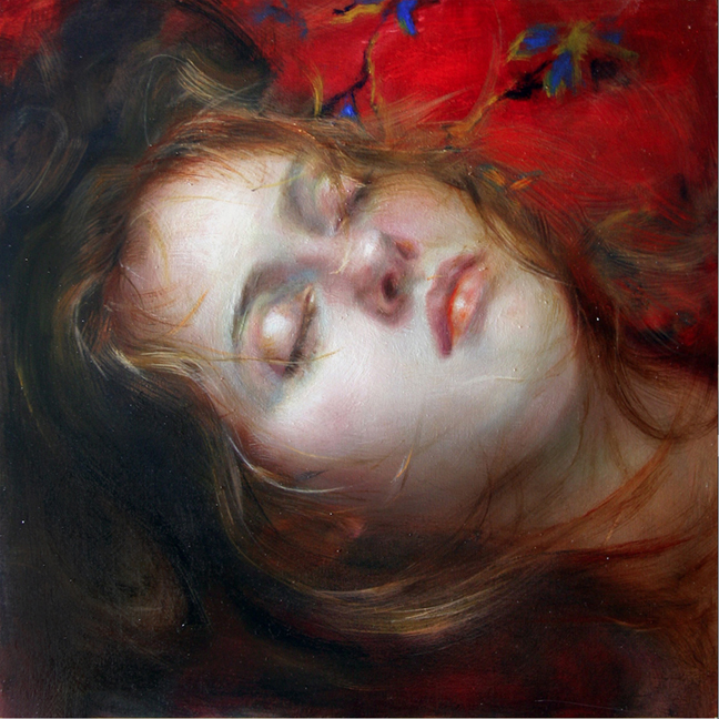
But this is a portrait of me at the peak of my Dad’s illness. The light and shadow representing the time we spent together painting. The ferret, the pain of watching him diminish.
And here is Dad’s reproduction of “Lady and the Ferret.” It now hangs proudly in my studio.


 Oil on Linen 12″ x 12″


